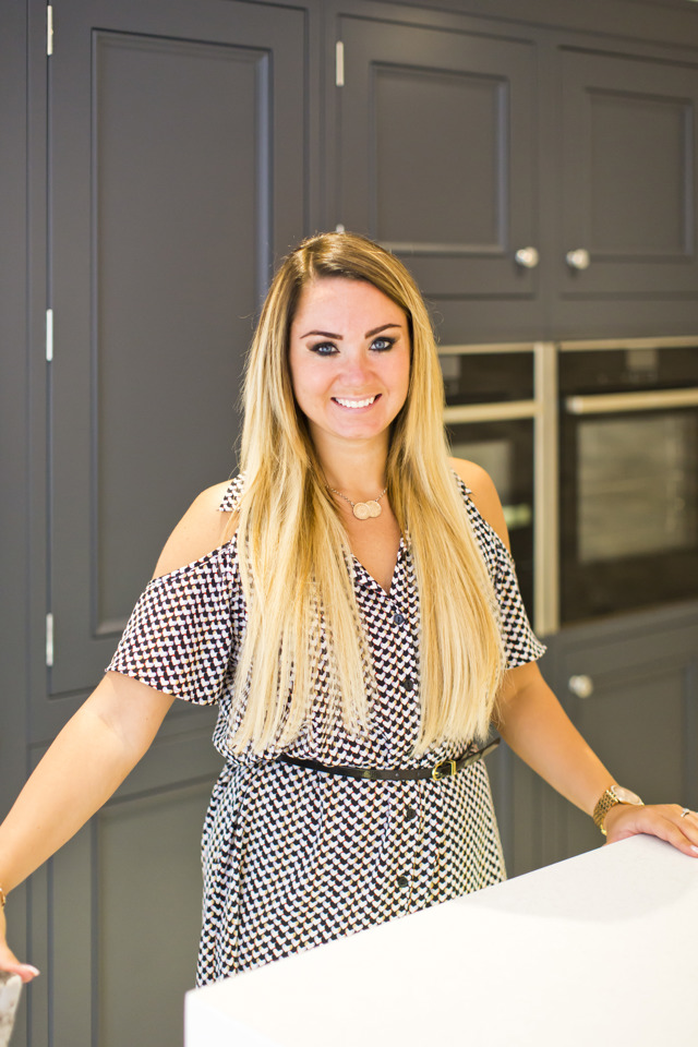
In this Journal entry, Katie talks us through a recent design project, while sharing her thoughts and top tips on working the dark blue kitchen trend that’s set to sweep the nation this year.
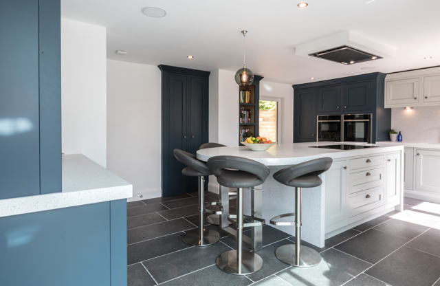
“My client wanted to completely transform their dark and outdated room, into a light, spacious kitchen they could love spending time in. The vision was to create a social hub, with a breakfast bar where they could all sit as a family and be together while they cooked meals.
“In terms of the appearance of their kitchen, the family wanted a contemporary twist on a traditional style. We decided on the 1909 In-Frame Shaker, combined with a beautiful two-tone colour palette and soft close hinges, to bring a contemporary edge to a classic kitchen.”
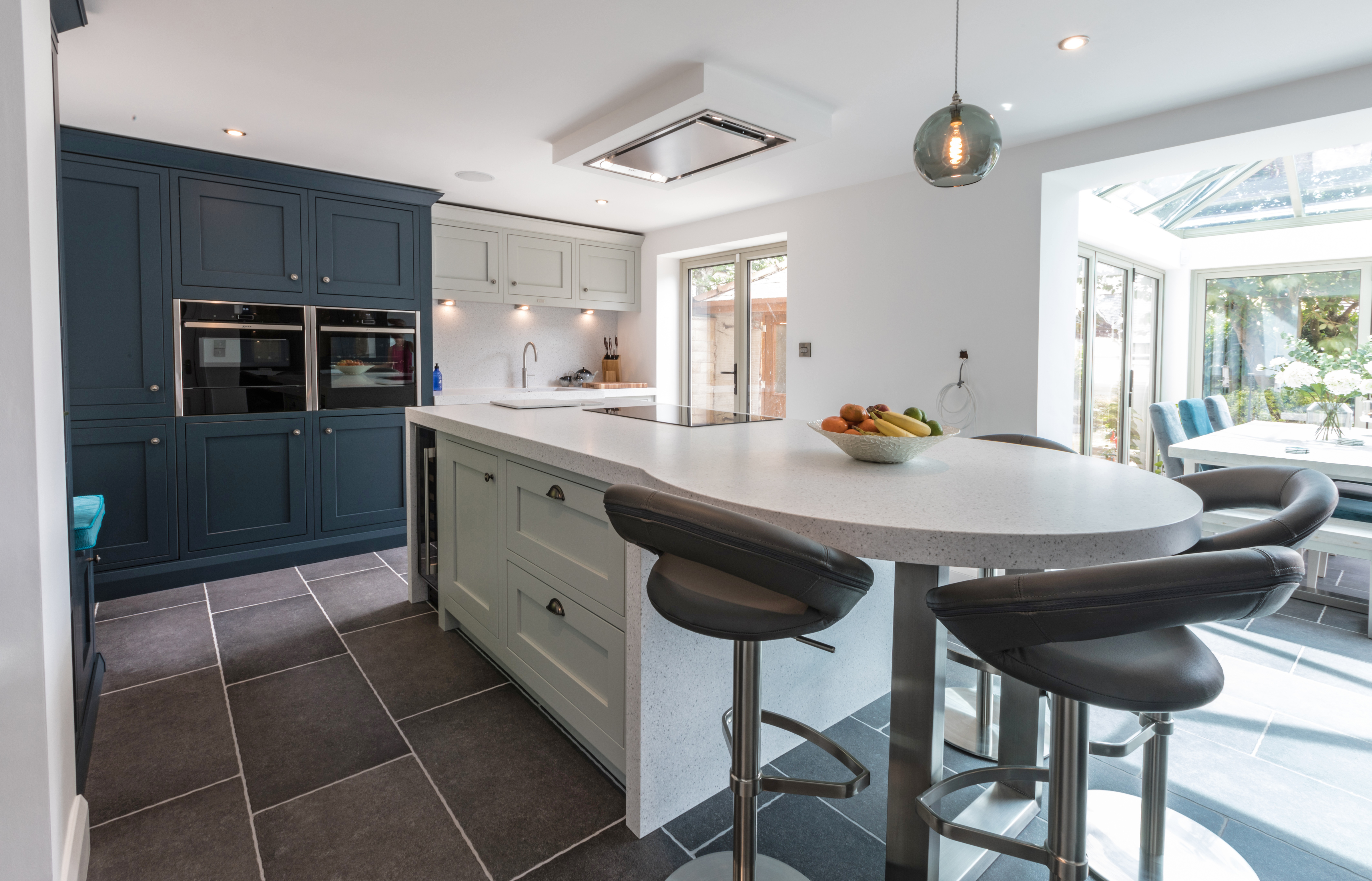
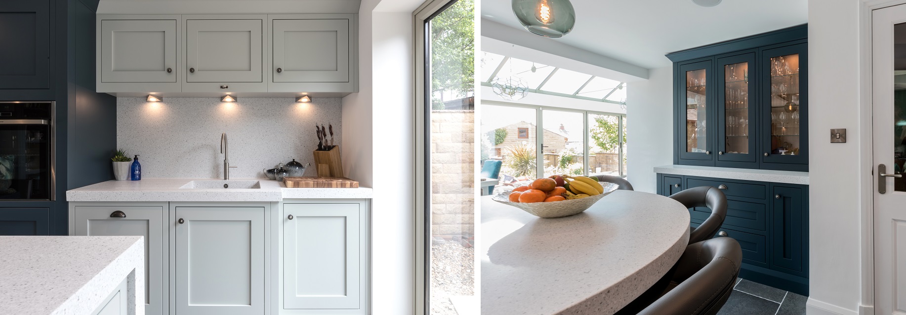
“Definitely! You can create an amazingly dramatic and atmospheric space with a dark blue palette, whether it’s used on the full kitchen, or combined with another colour for a two-tone look. I’ve seen so many kitchens with the wow factor thanks to the introduction of dark blue, so I’m glad it’s set to be popular this year.”

“Light grey shades are perfect for complementing the tone of Hartforth Blue. I would have to say Dove Grey is one of my favourite colours to pair with it, but as you can see from my recent project, Partridge Grey also sits really nicely alongside it.”
“Personally, I would recommend keeping your flooring, worktops and wall colour light when working with a Hartforth Blue kitchen. The colour will create enough of a statement on its own, so using simple tones that complement the shade will help it truly shine.
“A difficulty could be that a space doesn’t have enough natural light to bring the blue to life. If you feel that your space could do with an extra boost in the light department, I would suggest under cupboard lighting or pendants over a breakfast bar for an easy, attractive fix.”
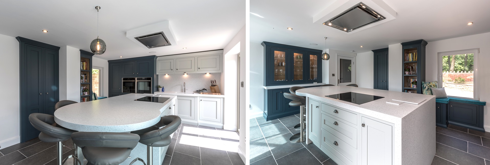
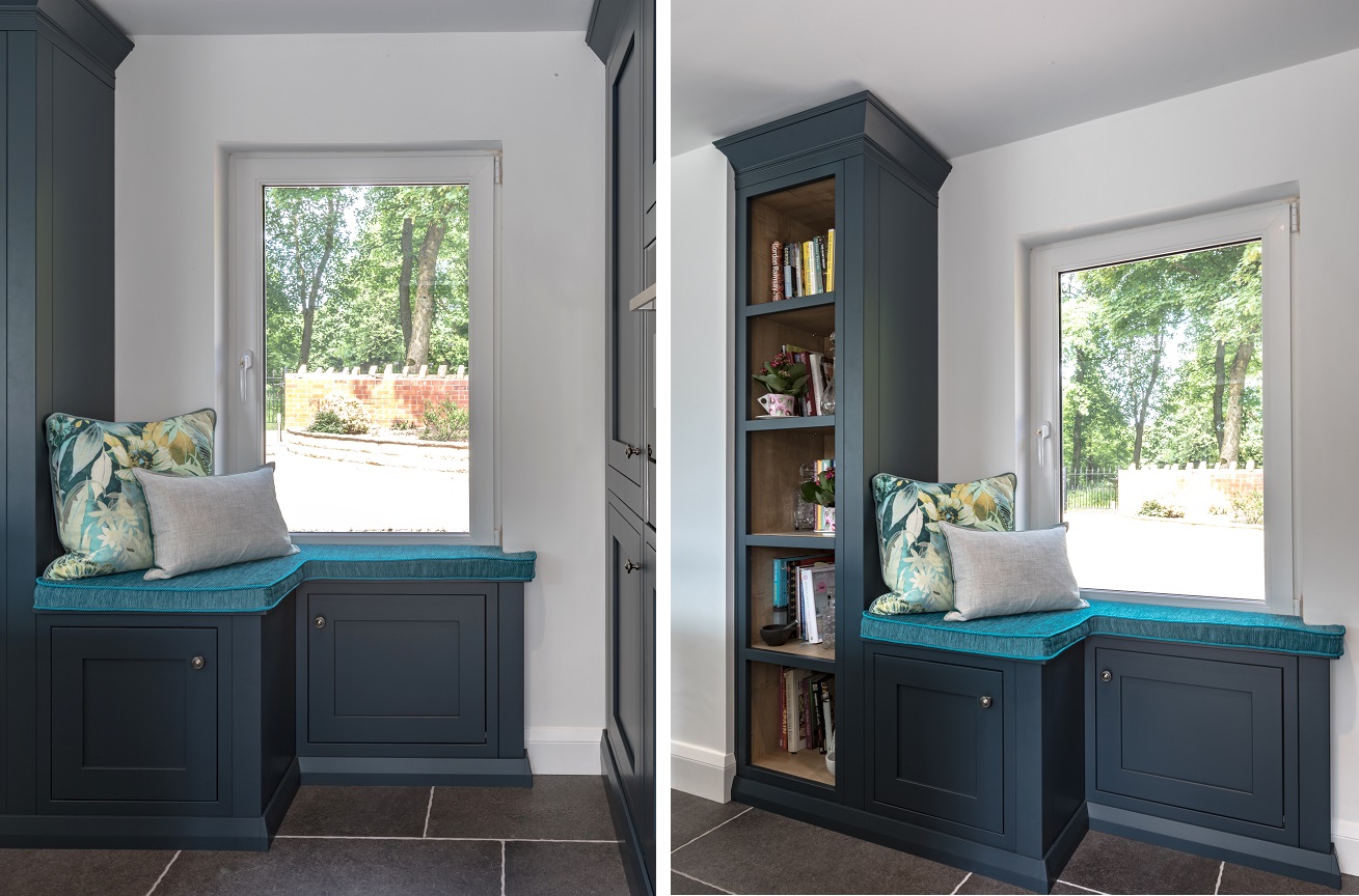
“I loved creating the Hartforth Blue window seat and bookshelf area from 1909 bespoke items – it looks great and adds a unique feature to the space that is bound to be a talking point when the family entertain!”

“I have some really exciting designs and installations booked in for 2019 which I can’t wait to share. As we grow as a company, we’re gaining larger 1909 kitchens installations, which is great as it’s one of my favourite ranges to design with!
“I’m really hoping to use the Ovolo door this year as I absolutely love this style. It’s so beautifully versatile and you can be really creative in using all of the design features available. I would also love to use Dry Rose in a clients design in 2019, as I think it would look amazing with Hartforth Blue and light worktops.”
“I do! In March we have a Hartforth Blue and Dove Grey installation planned. I’ve kept the worktops light and airy, and they are to be teamed with a porcelain, limestone coloured floor, pendant lighting and a mantle area decorated with feature tiling in different tones of blue. I can’t wait to share the finished space!”
For more information on our available colours: https://www.1909kitchens.co.uk/paint-palette
Check out Heart Of Your Home Kitchens: https://heartofyourhomekitchens.co.uk/
Find more of Katie’s design projects on Instagram: https://www.instagram.com/heart_of_your_home_kitchens/?hl=en
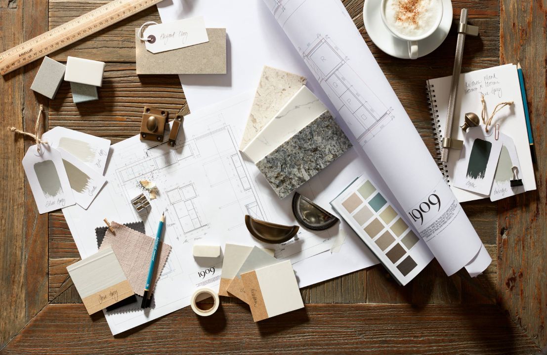
Book a complimentary design session with your local 1909 expert to start planning your dream kitchen.
With our beautiful brochure, you can explore 1909 inspiration from the comfort of your very own home.